
When I joined Unacademy as a Senior Designer, the illustration system was built around geometric shapes - designed that way intentionally, for flexibility, so non-illustrators on the team could use it. Practical thinking. But over time it hit a ceiling. The style had become saturated - internally overused, visually undifferentiated, and no longer capable of carrying the brand's growing ambition.
Something needed to shift.


Impact
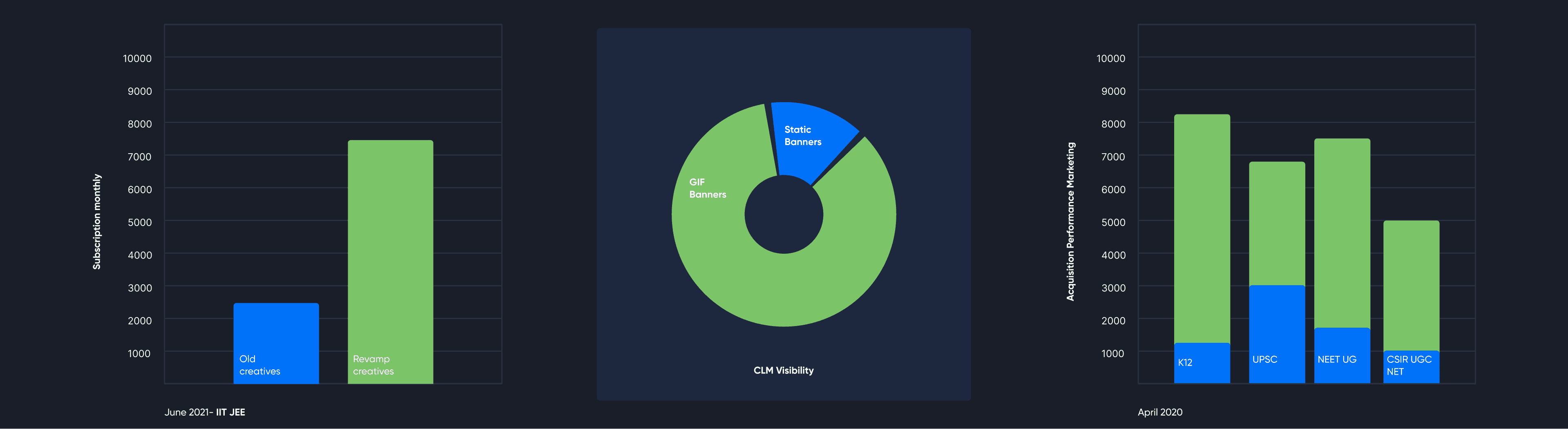
The major impact was observed in IIT JEE as a category, which performed excellently after the revamp of the creatives, which I led. The revamp included a change in colour, more relatable illustrations, multiple A/B tests, and the selection of top educators. The growth in CLM was significant because, instead of static banners, I proposed GIF banners, which drove both conversion and acquisition, as the audience (students/parents) found them more engaging. For each GIF concept, I prepared a deck each week, giving the team a clear runway to plan and execute animations effectively. The content team and others soon joined in, brainstorming ideas together for the GIFs.
I also owned the performance marketing creative for 2021–2023, overseeing the process from design through shipping under my supervision. I designed the core templates, which the agency then adapted into multiple sizes for Google, Facebook, and Affiliate platforms. This drove significant growth in conversion and acquisition - with acquisition being the primary driver, as most new users were drawn in to explore multiple classes. Over the tenure of two years, I designed over 980+ marketing master templates and got over 2,507+ templates adapted.
What I noticed
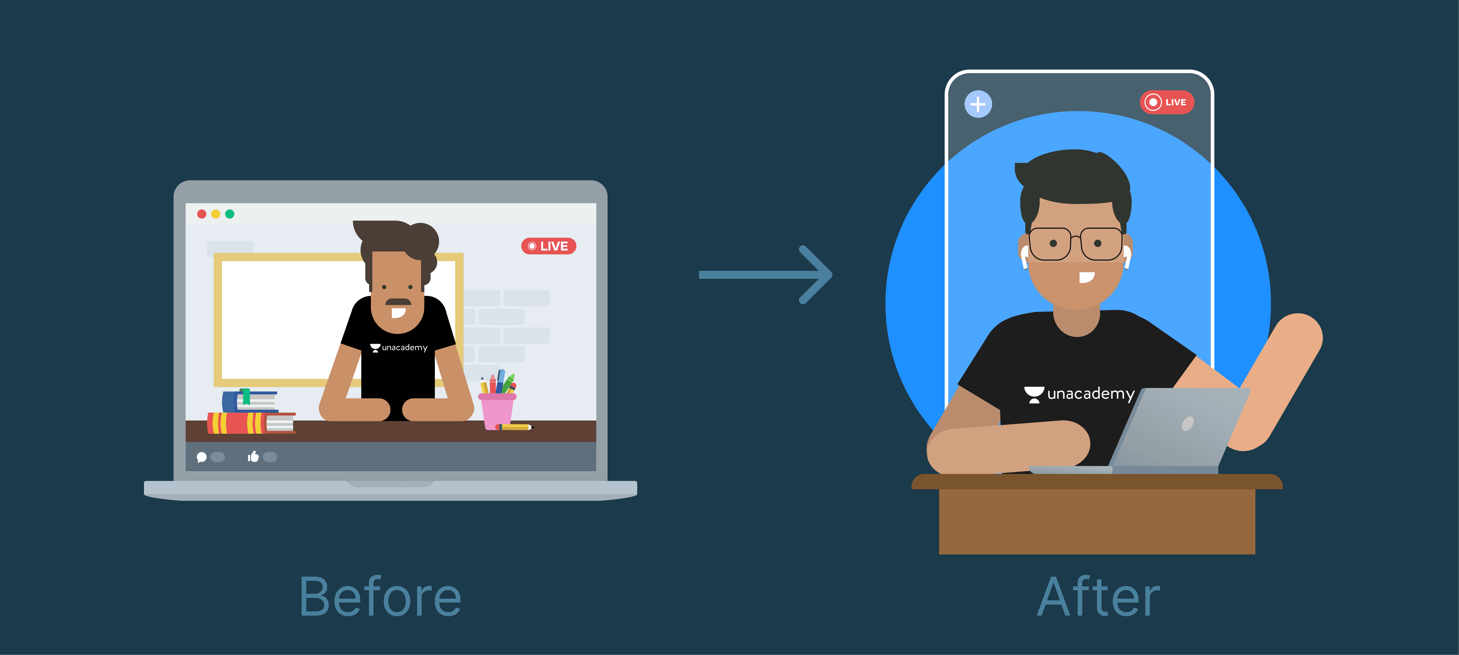
Geometric shapes gave the system consistency but no character. Unacademy was an edtech brand — its entire world was educators and students, real people with real energy. The illustration system didn't reflect any of that. It was clean but cold.
I saw an opening: take the geometric foundation, push it toward something with more humanity. Not detailed portraiture — that would break the system's scalability — but characters with enough specificity to feel alive. Educators. Students. People you'd recognise.
What I built
I introduced isometric illustration as the new direction — keeping the geometric DNA but adding dimension, warmth, and a visual language specific to education. I built a bank of educator and student characters: recognisable types, consistent style, flexible enough to appear across every format the brand ran — campaigns, emails, in-app, performance marketing.
The system wasn't just a style guide. It was a production framework — built so the team could generate new illustrations consistently, without everything needing to come back to me.
The clearest proof of the idea working: Unlock20. A vague brief — 20% off on subscriptions, make it feel like a moment. I interrogated what "unlock" actually meant, not just as a word but as a visual — and landed on a keyhole, with "20" peeking through it. Opportunity. Access. A second chance. The concept ran across formats, drove a subscriber jump from 25,000 to 75,000 in a single day, and the campaign template was still being used - with colour variations — after I left.
What actually happened
I was promoted from Senior Designer to Lead Designer during this time, managing a team while continuing to own my illustration direction and performance creative personally. The illustration bank I built became the foundation other designers worked from — not just while I was there, but for years after.
Four years after leaving Unacademy, the visual language I built is still running the brand.

What I took from it
A good illustration style is easy to copy. A system is harder to replace — because a system isn't just about how things look, it's about how a team thinks and works. The goal was never to make beautiful illustrations. It was to build something that could scale without me.
That's still how I think about every creative system I build.